Transient Labs

Reducing drop-off and churn with information architecture

Role

Product Designer

Industry

Fintech (Blockchain)

Duration

4 months

a cell phone on a bench

Overview

Transient Labs is a suite of web3 tools for creators and brands. Stacks is a new product offering in which digital creators can create, customize, and deploy digital artwork on the blockchain, via Transient Labs's smart contract creation platform The Lab.

The overarching goal of this project was to increase user adoption, by reducing confusion on how to use the platform.


Information Architecture Audit

The problem was reduced to 1 thing: confusion. Users unanimously expressed finding the whole process overwhelming and confusing. To begin to fix this, I began by mapping the whole process on FigJam (access here). Key issues included:

  • Endless steps. The process had 16 different screens to complete the process of uploading a single artwork.

  • Lack of context. Key decisions, like whether to create a token or a Stack (a collection of tokens), were not explained through the process.

  • Lack of hierarchy. There was no differentiation of required inputs versus nice-to-have inputs.

  • Prolonged time to activation, as a result of the above issues.

a cellphone leaning against a wall

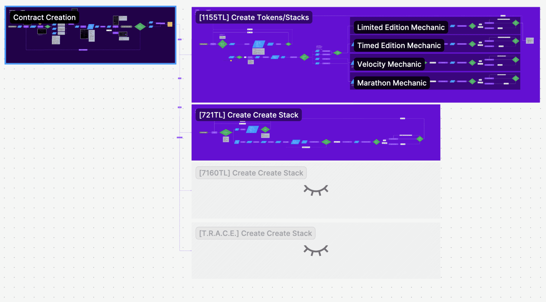
User Flow mapped in figjam

a cell phone on a ledge

IA audit

Design Strategy

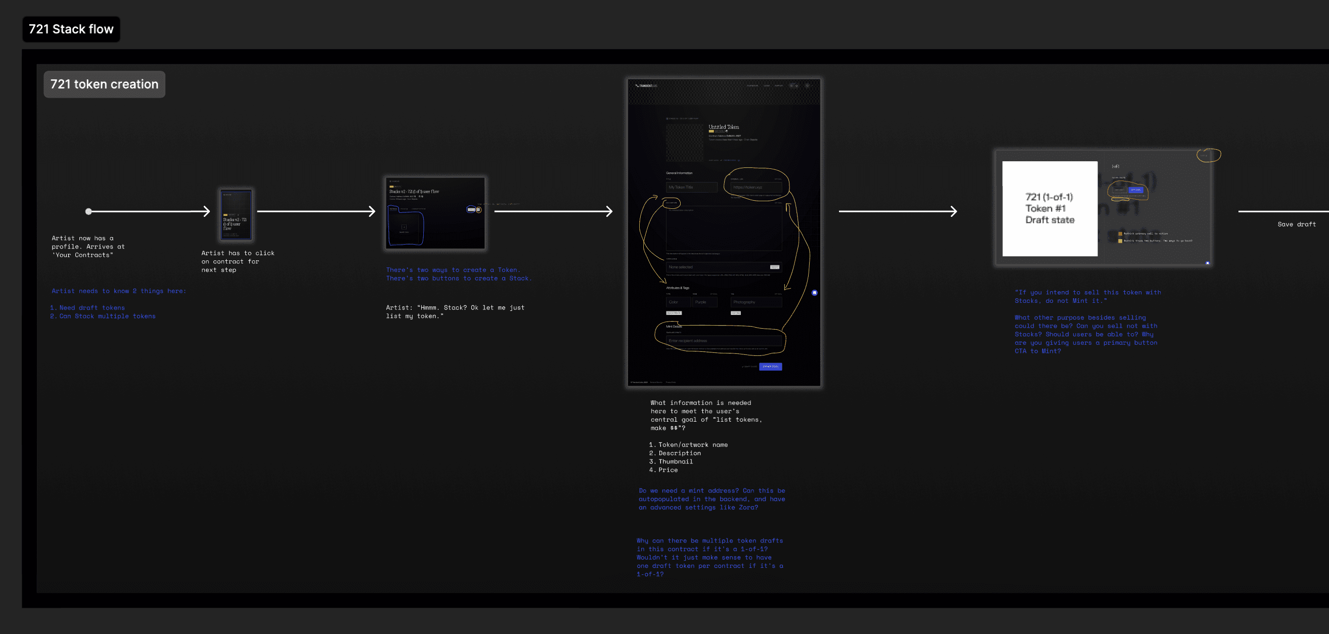
My strategy began with questions:

  • How can we reduce information overload?

  • What user inputs are critical? Which ones are nice-to-haves and can be collapsed as optional inputs?

  • How can we improve activation, as quickly and frictionless as possible?


With an audit and these questions in mind I began to ideate a user flow that addressed the problems with the following features:

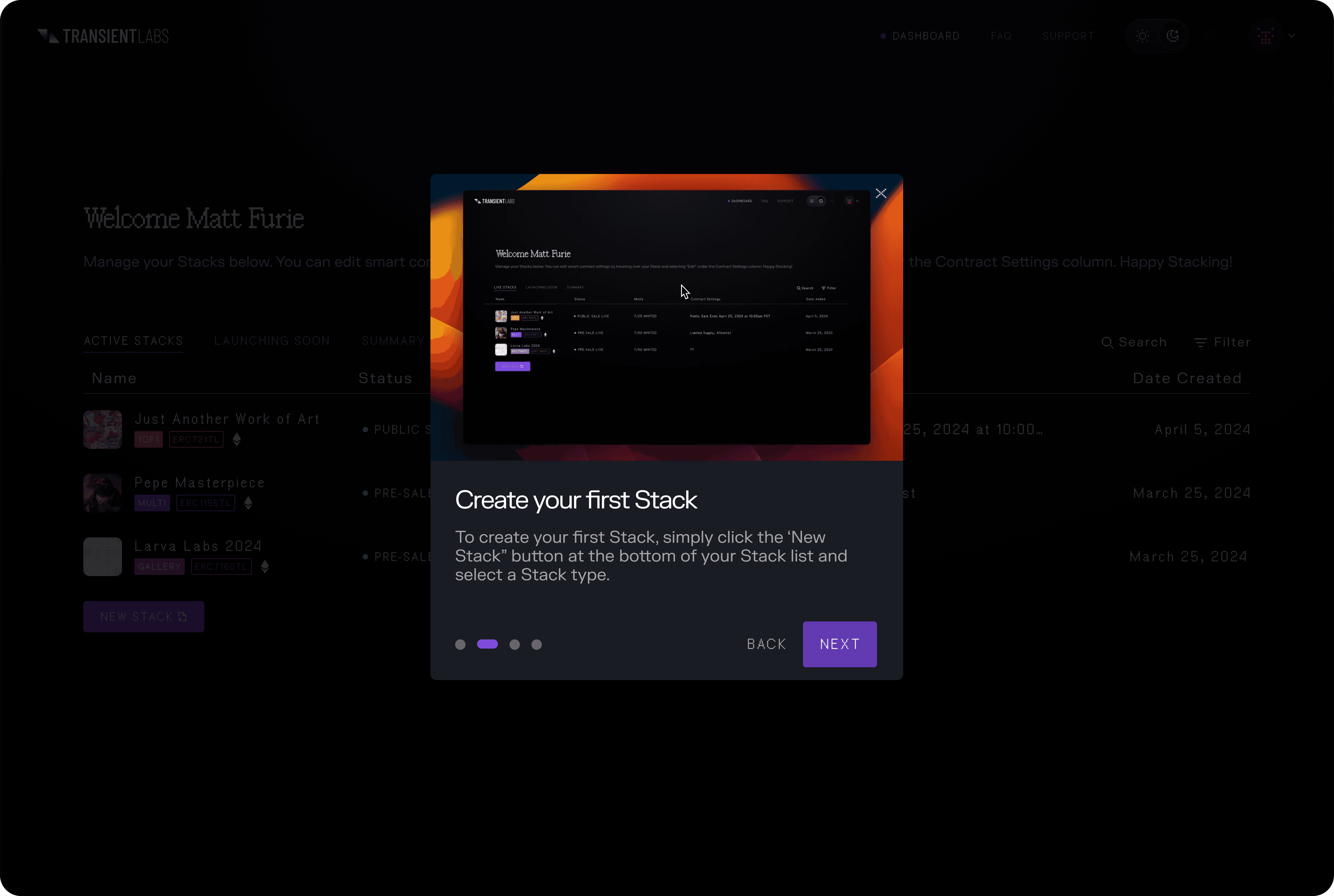
  1. Create an Educational Modal that was brief and gave an overview of the process

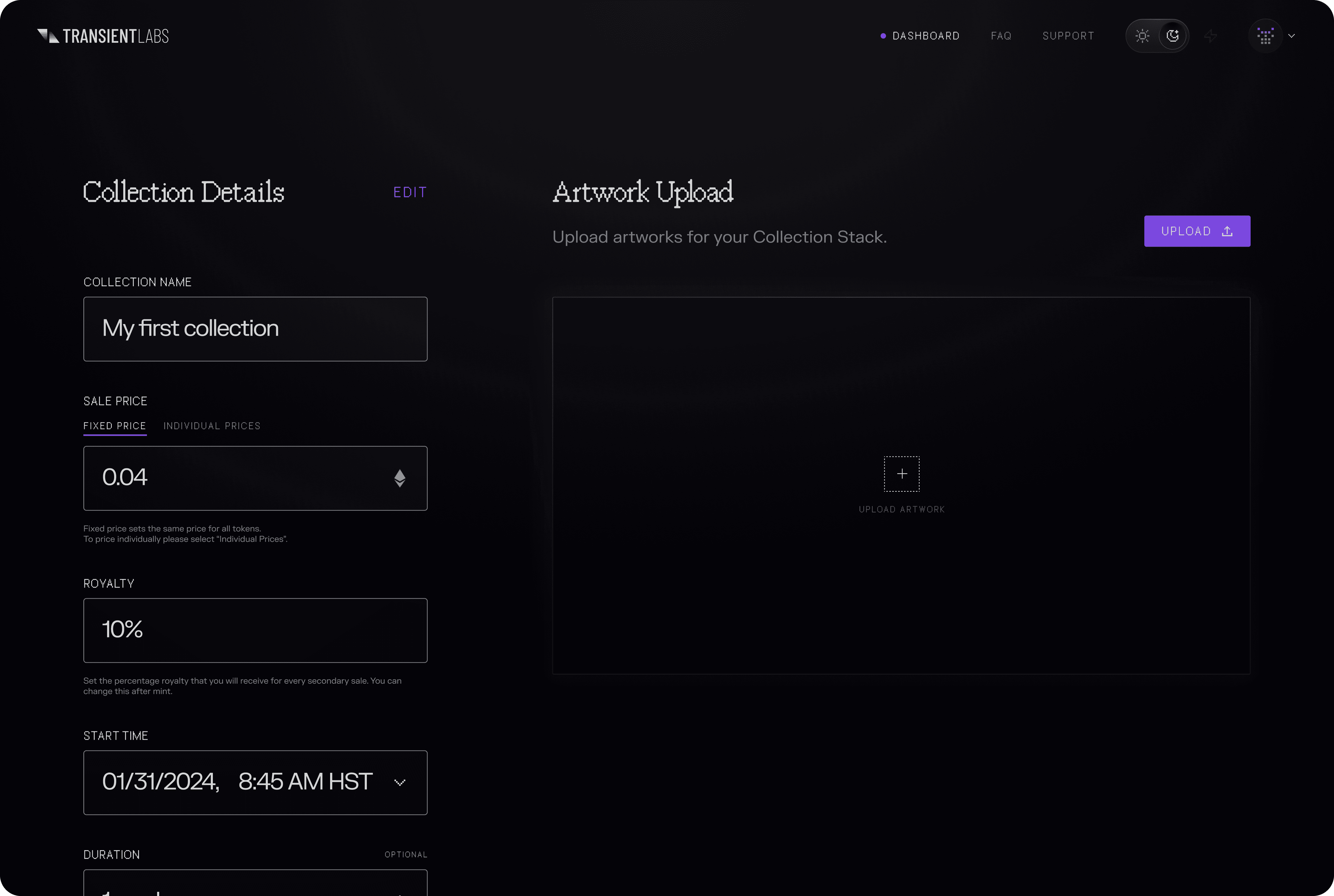
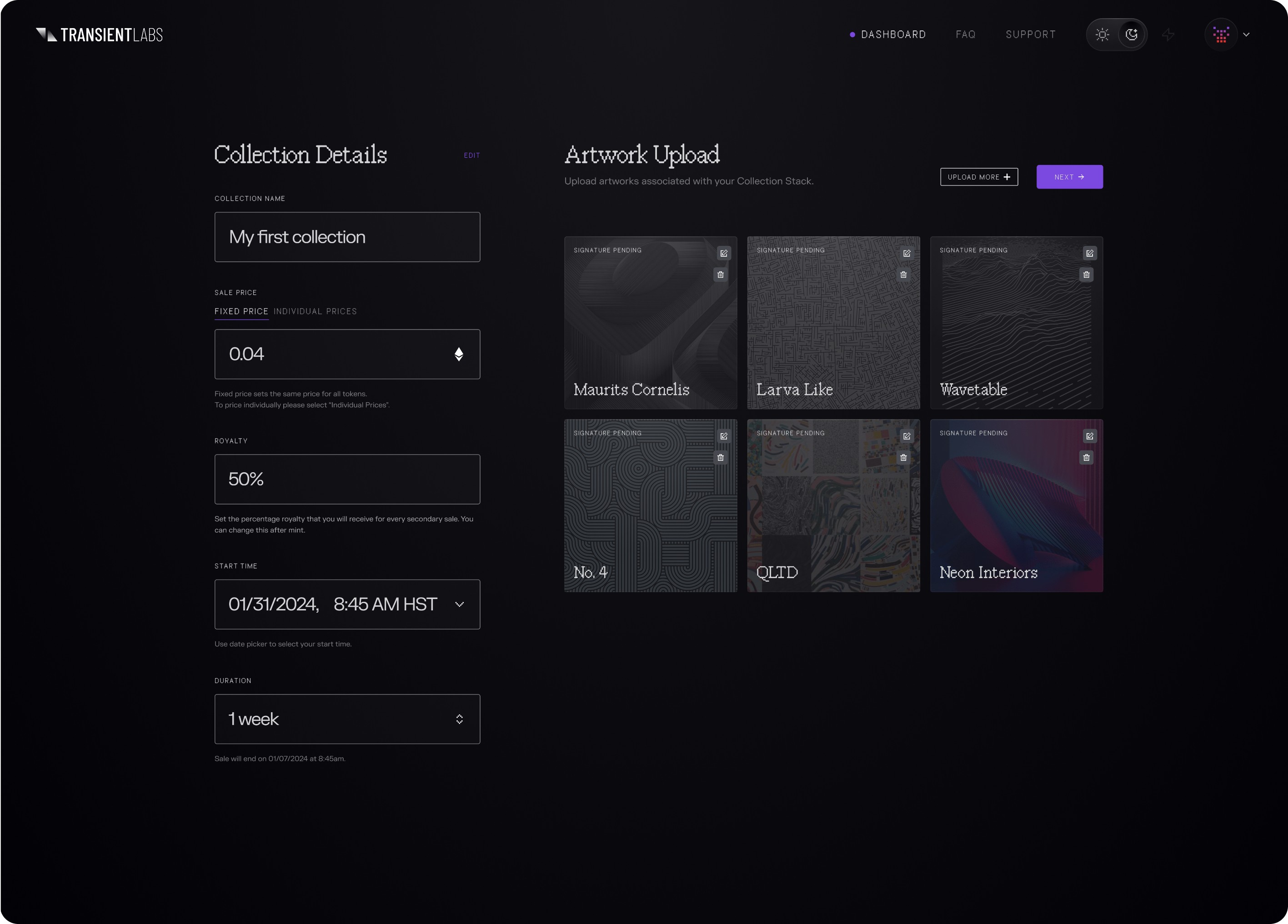
  2. Consolidate the number of screens into 4 main ones: Home Screen, Stack creation, Transaction Approval, and Success.

  3. Prioritize required inputs by placing them in order of importance, and consolidate non-critical inputs into an "Advanced" drop-down that allowed users to customize further if they wanted to.
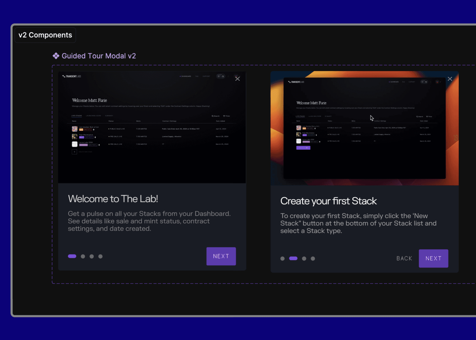
a cell phone on a ledge

Educational Modals

a cell phone on a table

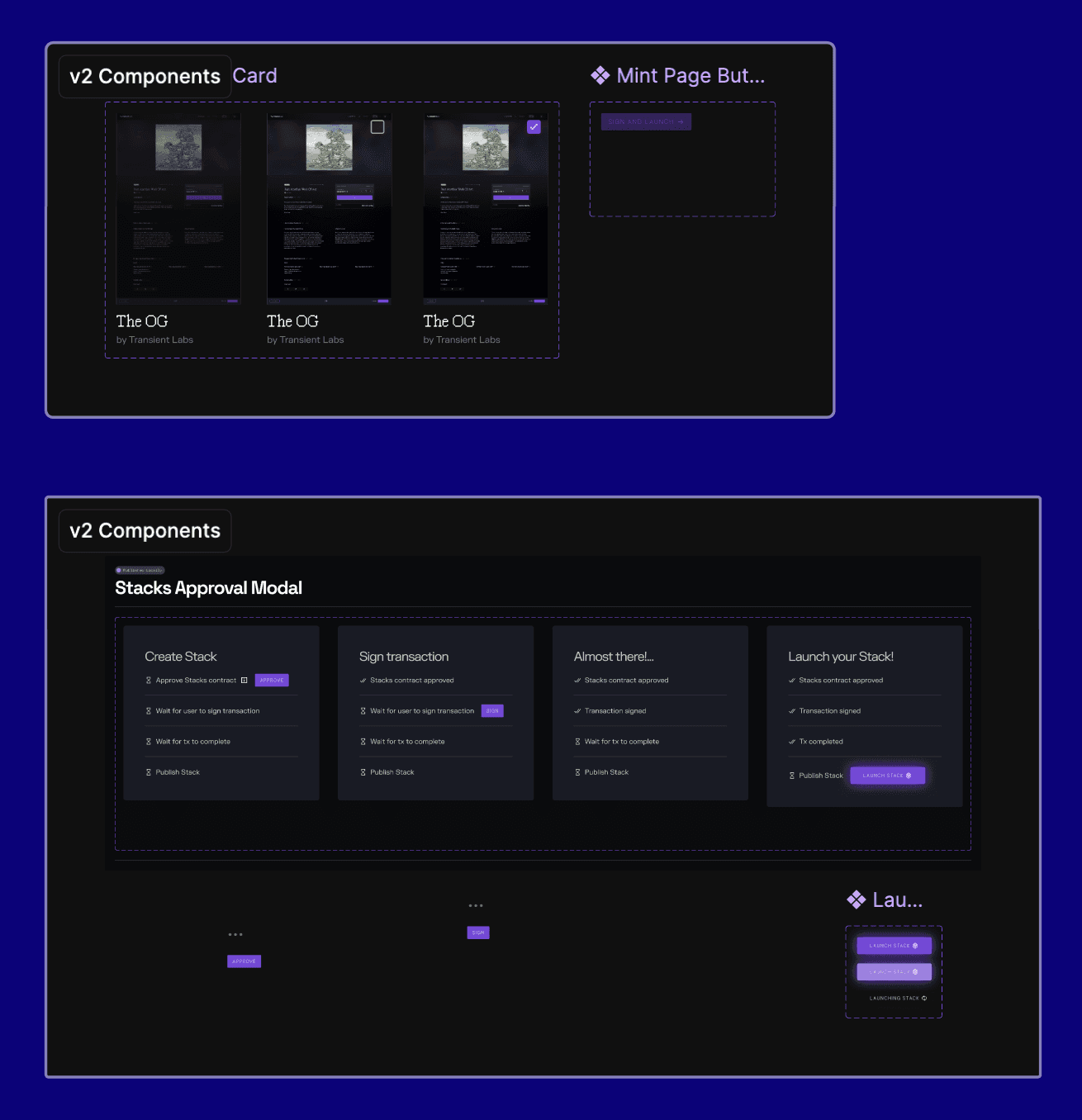
Component Documentation

a cell phone on a bench

Outcomes and Impact

While I did not have access to metrics, the intended impact of the final design included:

  • Improved activation

  • Reduced task completion time

  • Reduced drop-off and abandonment rates


This was achieved by adding onboarding educational modals, removing optional input steps that were not critical to activation and task completion, and condensing the interface from a 16-screen process to only 4 screens.

Additional work:

  • Prototyping: Using Figma's advanced prototyping features I created a prototype using conditional logic, while adhering to using UI from Transient Labs's design system.


  • Presentation: With a 2 week deadline for this specific project, I created a Loom video to present the new design. Noting metrics to track (task completion rates, drop off rates, direct user feedback) as guiding principles for the design.


  • New Components Documentation: For this new design, I created a section within Figma with all new components, variables, and states for each component. This allowed for clear, organized visibility upon approval of shipping the new design.

Other projects

Francisco Mendez Sosa

Copyright 2025 by Francisco Mendez Sosa

Francisco Mendez Sosa

Copyright 2025 by Francisco Mendez Sosa

Francisco Mendez Sosa

Copyright 2025 by Francisco Mendez Sosa